· Menu & Food · 9 min read
Menu Copywriting: Writing Descriptions That Sell
How to write menu descriptions that increase sales by 27% using sensory language, sourcing details, and behavioral pricing principles.
Most restaurant owners spend months perfecting recipes and thousands of dollars on interior design, then write their menu descriptions in an afternoon without any real framework. That mismatch is a direct hit to your revenue. Cornell University research has demonstrated that detailed, sensory-rich menu language increases sales of individual items by 27% — which means your copy is either working for you or against you every single service.
This article is a practical guide to writing menu descriptions that actually sell. It draws on behavioral research, design psychology, and what operators have learned about the gap between “chicken breast” and “herb-brined, oak-grilled chicken.”
Why Descriptions Matter More Than You Think
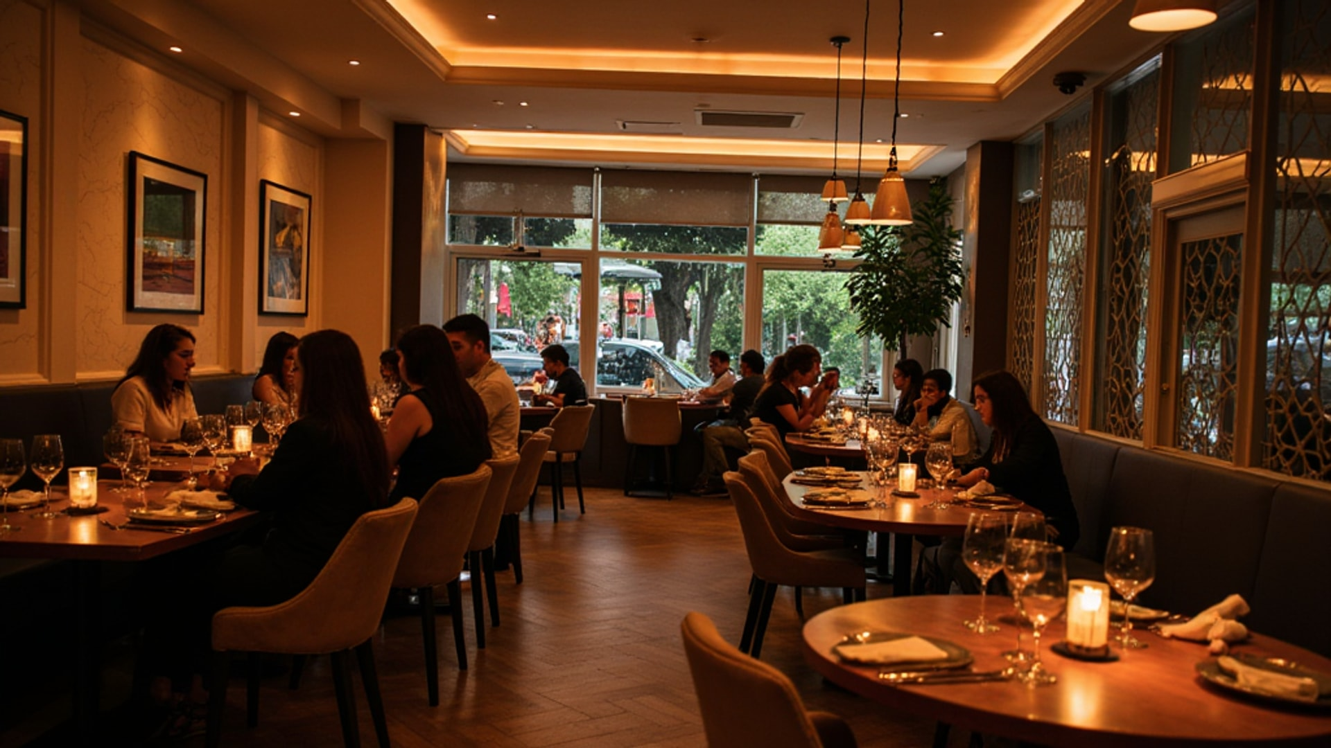
Customers spend an average of about two minutes deciding what to order. During that window, your menu description is the only salesperson you have at the table — the server hasn’t spoken yet, no food is visible. The customer is reading a few lines and forming a complete impression of the dish, the price, and whether it’s worth ordering.
Cornell’s research found that 65% of diners cite menu descriptions as the most important factor when choosing a dish. Not the price. Not the name. The description. That shifts the burden of proof: if your descriptions are generic, you are actively leaving revenue on the table.
The good news is that this is one of the highest-leverage, lowest-cost improvements you can make to your operation. You don’t need new equipment, additional staff, or a menu reprint to fix weak copy — you need about a day of focused work and a clear framework.
The Sensory Language Principle
The most common mistake in menu writing is using words like “tasty,” “delicious,” and “mouth-watering.” These words communicate nothing. Every restaurant claims their food is delicious. The claim is so universal it has lost all meaning.
What actually moves customers are sensory-specific words that help them imagine eating the dish before they order it. According to Restaurant Times, words like “smoky,” “caramelized,” “crisp-tender,” “herbaceous,” “tangy,” and “aromatic” outperform generic descriptors across virtually every menu category because they create a specific, believable sensory picture.
Think about the difference between these two descriptions:
Generic: Pan-seared salmon with lemon butter sauce and vegetables
Sensory: Cedar-planked Faroe Island salmon with charred lemon beurre blanc, wilted lacinato kale, and crispy capers
The second version tells the customer how it tastes, how it looks, where it comes from, and what techniques were used to make it. That’s not pretension — that’s information. And information builds confidence in the ordering decision.
Preparation Method as a Differentiator
Common dishes appear on dozens of menus in your market. Grilled chicken, pasta, burgers, salmon — your competition has all of them. The preparation method is often the only place where your version is genuinely different, and descriptions that highlight technique create differentiation that price alone cannot.
“Slow-braised for eight hours” communicates patience and depth. “Wood-fired” implies craft and flavor complexity. “Hand-rolled” suggests artisanal care. “House-cured” implies mastery and process. These phrases justify pricing and separate your dish from the generic version available at the place down the street.
According to Restaurant Times, preparation method language is particularly effective for proteins and carbohydrates where the baseline dish is familiar. The cooking process becomes the story.
Geographic Origins and Sourcing Details
Naming the origin of key ingredients adds two things: perceived premium quality and a narrative. Customers consistently perceive geographically identified ingredients as more expensive, more authentic, and of higher quality — whether that perception is always accurate is secondary to the commercial reality that it influences ordering behavior.
“Salmon” becomes “Faroe Island salmon.” “Beef” becomes “Angus beef from Double R Ranch.” “Parmesan” becomes “Parmigiano-Reggiano, aged 24 months.” “Pork” becomes “Berkshire pork.”
These details also give servers natural conversation material when presenting dishes or responding to questions, which helps tableside upselling.
The key is specificity. A vague “locally sourced” claim has less impact than “heirloom tomatoes from Ridgeline Farm, 12 miles east.” If you have real sourcing stories, use them precisely. If you don’t, build them — the relationships with suppliers that produce genuine origin stories are worth developing.
Brevity: Two to Three Lines, Then Stop
Effective menu descriptions are not essays. The most successful copy runs two to three lines — enough to communicate the essential character of the dish, short enough to maintain the scanning rhythm that customers need to move through the menu comfortably.
When descriptions run longer, they create friction. Customers skip them or skim them, which means your carefully crafted copy gets ignored. Shorter descriptions are read more completely, which means each word carries more weight.
The discipline is in selection: choose the two or three most compelling attributes of the dish — the key technique, the hero ingredient, the dominant flavor profile — and describe only those. Cut everything else. If a description takes four lines to say what it needs to say, the dish is probably too complex or the copy needs tightening.
Active voice helps. “We slow-braise the short ribs for eight hours until the collagen has fully broken down” is more engaging than “Short ribs are slow-braised.” Active voice puts the kitchen in the story and communicates intentionality.
→ Read more: Menu Design and Layout: The Visual Psychology That Drives What Guests Order
Price Presentation: What Cornell’s Research Shows
Cornell University’s School of Hotel Administration conducted a foundational study at the Culinary Institute of America’s upscale restaurant testing three price formats: prices with a dollar sign ($12.00), prices written out in words (twelve dollars), and numerals without monetary cues (12).
The finding was clear: when monetary symbols appeared on the menu, customer spending decreased by 8.15%. Menus with numerical prices and no dollar signs increased average spend by $5.55 per cover.
The explanation is behavioral: monetary symbols trigger what researchers call the “pain of paying” — a psychological response that makes customers more cost-conscious and conservative. Removing dollar signs reduces that friction, making the ordering process feel less like a financial transaction and more like a selection from possibilities.
The study also found that price-ending patterns influenced perception: prices ending in 0 were associated with higher quality, while prices ending in 9 signaled better value. This means your pricing strategy should align format with positioning — a premium wine list stripped of dollar signs with round numbers reads differently than a value-focused section with 9-ending prices.
An important caveat: Cornell’s research also established that operational factors — party size, dining duration, table location, and individual spending propensity — play a significantly greater role than price format in determining check size. Menu design optimization is a meaningful lever, not a magic fix. It works alongside strong service, quality food, and good operations — not as a substitute.
Exclusivity Language and the Scarcity Effect
Language that signals limited availability, seasonal specificity, or chef-level selection triggers scarcity psychology and encourages immediate ordering rather than deliberation. This works because customers fear missing out on something that may not be available next visit.
Effective exclusivity phrases include:
- “This week only”
- “Limited to 12 portions per evening”
- “Chef’s selection, based on market availability”
- “Available through the end of the season”
- “Tonight’s catch, depending on the day’s harvest”
This language works especially well on specials and high-margin items where creating urgency serves the dual purpose of driving orders and generating traffic from customers who want to try the item before it disappears.
The rule is honesty: exclusivity language that turns out to be permanent erodes trust when regulars notice. Reserve it for items that genuinely rotate.
Typography and Visual Context
The words you write exist within a visual system, and that system shapes how the words are received. According to research documented by Lisi Menu, italicized fonts are perceived as more elegant and upscale, making them effective for featured items and premium sections. Handwritten or script-style fonts trigger associations with artisanal, homemade quality. Sans-serif fonts read as modern and casual.
The implication is that font choice should match your concept and reinforce your brand positioning. A farm-to-table restaurant benefits from fonts that suggest crafted authenticity. A modern fast-casual concept calls for clean, contemporary typography. When font style mismatches concept tone, it creates cognitive dissonance that undermines both the menu reading experience and the brand impression.
Well-designed menus that leverage both typography and copy can increase sales by up to 20%, according to Lisi Menu. Color also matters: red accents on featured items create energy and draw attention; green signals freshness and health for vegetable-forward dishes; gold or warm yellow implies luxury appropriate for premium wine lists or tasting menus.
High-quality food photography can increase item sales by up to 30% when executed well — but poorly executed photography can damage the perception of items it depicts. If you can’t do it at a quality level that accurately represents the dish, skip it.
→ Read more: Menu Color and Typography: The Visual Science of Selling More Food → Read more: Menu Photography and Food Styling: Visual Standards That Sell
A Practical Revision Framework
Run your existing menu through this checklist:
Cut generic words. Find every instance of “tasty,” “delicious,” “amazing,” “mouth-watering,” and “flavorful.” Replace each with something specific.
Add preparation method. For every protein dish, name the cooking technique. “Grilled,” “seared,” “braised,” “roasted,” “poached,” “smoked” — pick the right one and use it.
Name the origin. For your most important ingredients, identify where they come from. If you don’t know, find out. If you can’t trace them, that’s a purchasing gap worth addressing.
Tighten to two to three lines. Cut anything that doesn’t directly communicate flavor, texture, technique, or provenance.
Check your price format. Consider removing dollar signs from at least your food menu, especially if you are in an upscale or mid-market positioning.
Add one exclusivity phrase per section. Not everywhere — that dilutes the effect. Pick your high-margin Stars and make them feel special.
The entire process of revising an existing menu takes four to six hours of focused work. The return, based on Cornell’s documented 27% sales lift on well-described items, makes it among the most efficient investments in your operation.
→ Read more: Menu Engineering: How to Build a Profitable Menu → Read more: Cross-Selling Through Menu Design: Techniques That Lift Average Check