· Marketing · 7 min read
Menu Psychology and Design: The Science of Getting Guests to Order What You Want
How to apply behavioral science to your menu design — from pricing tactics and layout to descriptive language and color — to increase average check and profitability.
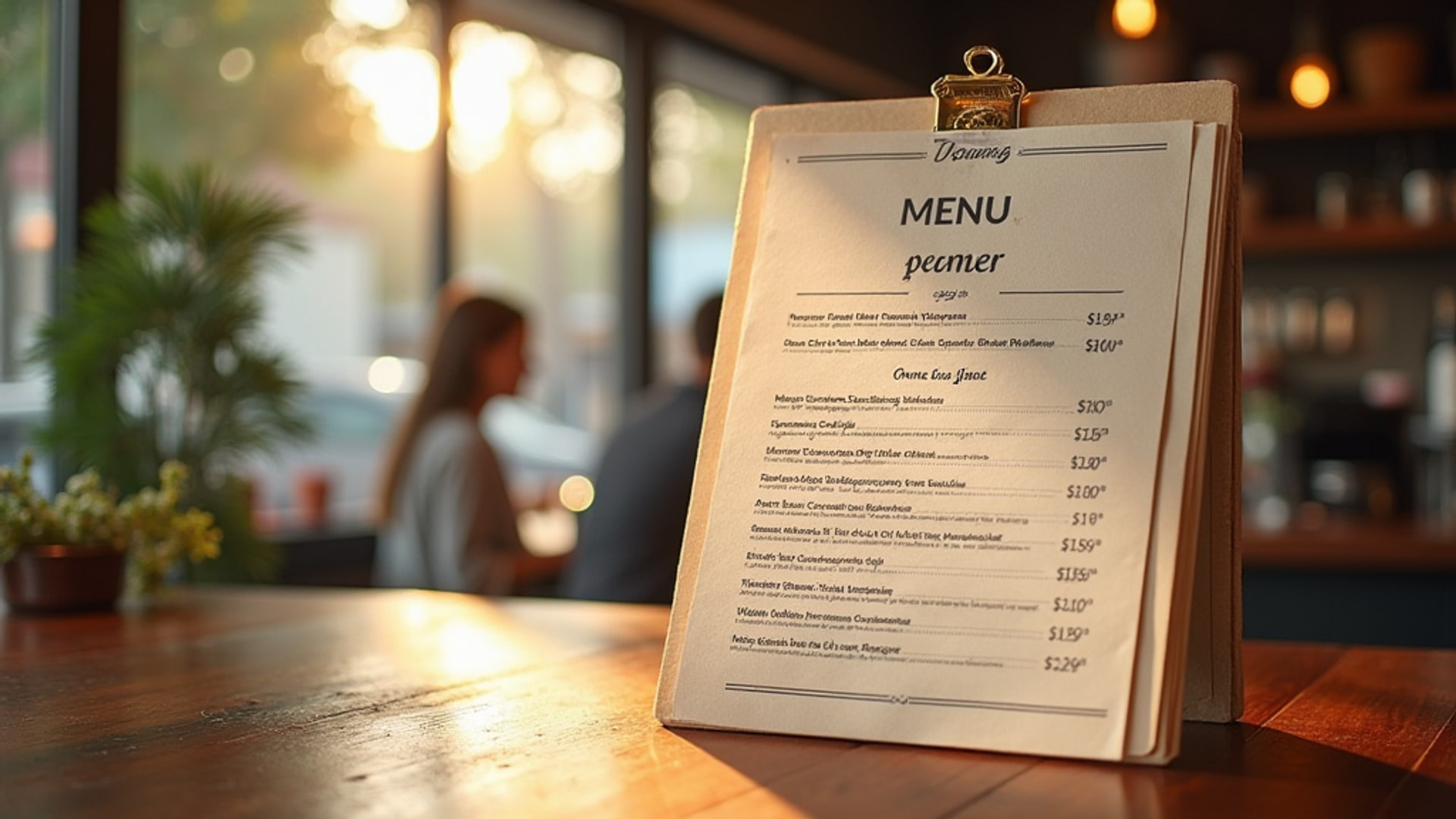
Aaron Allen & Associates calls your menu a “silent salesperson.” Every design choice — the number of items, the layout, the pricing format, the color scheme, the language — influences what guests order. Most operators create menus to list what they offer. The most profitable operators engineer menus to direct customer behavior toward high-margin outcomes.
The difference between an accidental menu and an engineered menu is measured in percentage points of average check — and at scale, that is significant money.
The Psychology of Pricing: Three Tactics That Work
Remove Currency Symbols
Aaron Allen & Associates’ research shows that removing currency signs from price displays reduces emphasis on cost and increases spending. The psychological friction of a dollar sign — or a euro, or a pound — triggers a “spending” mindset. A price listed as “24” rather than “$24.00” feels different to the same person making the same purchase.
Research consistently supports this. In a Cornell University study, diners spent significantly more when menus showed prices as numerals without currency symbols versus menus with dollar signs. Fine dining restaurants have known this for decades.
Practical application: Remove dollar signs from all menu prices. Present as clean numerals (“24”) or add a descriptive phrase instead (“twenty-four”). Avoid decimal points ending in .00 — they emphasize the round number cost.
Charm Pricing vs. Clean Pricing
Charm pricing — ending in .95 or .99 instead of round numbers — creates a value perception. A $10.95 pasta triggers a different perception than $11.00, even though the difference is negligible.
However, this works differently across dining segments:
- Casual and fast casual: Charm pricing ($11.95) signals value and volume
- Fine dining: Clean pricing ($26) signals premium and sophistication
Match your pricing format to your brand positioning.
Anchor and Decoy Pricing
Two of the most powerful pricing strategies in menu design:
Anchor pricing: Place a high-priced item prominently (typically at the top of a section). This establishes a price reference point that makes all other items seem reasonably priced by comparison. A $65 wagyu ribeye at the top of the mains menu makes the $38 branzino look like a bargain — even if $38 was your highest price before.
Decoy pricing: Add a third, strategically positioned expensive option that makes the target mid-range item appear to offer the best value. Example:
| Item | Price |
|---|---|
| Single burger | $14 |
| Double burger | $19 ← Target item |
| Double burger with premium add-ons | $25 ← Decoy |
The $25 decoy makes the $19 target feel like the smart, value-conscious choice — even though $19 was expensive before the decoy appeared.
Menu Layout: The Golden Triangle
Research on how diners scan menus reveals a consistent pattern: eyes typically move to the center first, then to the top-right corner, and then to the top-left. This “Golden Triangle” is prime real estate.
Where to place your highest-margin items:
- Center of the menu (if single-page)
- Top right of a two-panel menu
- Top left as secondary placement
The practical implication: your highest-margin dish should not be buried at the bottom of a section. It belongs at eye level and in the zones where attention lands first.
Section organization principles:
- Limit to seven items per section (the “7 plus or minus 2” rule from cognitive psychology)
- More than seven options creates decision paralysis, slower ordering, and lower satisfaction
- Group items logically within each section
- Place the most profitable item first and second in each category
Menu Length: Less Is More
A menu with 45 items looks impressive to the operator who wants to demonstrate range. It looks overwhelming to the customer who has to read it. The result: slower table turns, lower satisfaction, and ordering patterns that default to familiarity rather than exploring high-margin items.
The research supports tighter menus. SmarterSign’s digital menu board research confirms that best-selling items should be prominently featured to guide new customers toward proven choices. The same principle applies to print menus: feature fewer items, feature them better, and guide customers toward the items you want to sell.
Menu item reduction checklist:
- Remove any item with less than 5% order frequency over 90 days
- Remove any item with food cost above 40% that cannot be reduced
- Consolidate similar items into single, more defined options
- Evaluate whether every section serves a genuine customer need or just adds complexity
Descriptive Language: The Proven Sales Multiplier
Rich, sensory descriptions that evoke taste, texture, and origin consistently outsell identically prepared items with minimal descriptions. Items with detailed, evocative descriptions consistently outsell items with generic labels.
The progression from generic to engineered:
| Generic | Engineered |
|---|---|
| Grilled salmon | Wild-caught Pacific salmon, cedar plank grilled, with preserved lemon butter and herb-roasted fingerling potatoes |
| Chocolate cake | Warm dark chocolate lava cake with single-origin Guatemalan cacao, served with house-made vanilla bean ice cream |
| Caesar salad | Classic Caesar with house-made dressing, oven-baked sourdough croutons, and shaved Grana Padano |
Longer descriptions for high-margin items draw attention and signal perceived value. Use three to five descriptive phrases for your signature and highest-margin items. For standard items, a single line is sufficient.
Language that triggers appetite:
- Sensory words: crispy, silky, charred, bright, tender, caramelized
- Origin language: local, house-made, hand-rolled, wood-fired, slow-braised
- Timing cues: daily, seasonal, chef’s selection, market-fresh
- Emotional triggers: grandmother’s recipe, inspired by, our most-requested
Color Psychology: Influencing Orders Through Visual Design
Aaron Allen & Associates maps the effects:
- Green: Implies freshness and health — effective for salads, vegetable dishes, and health-conscious sections
- Orange: Stimulates appetite — works well for highlighted items, call-out boxes, and featured sections
- Red: Creates urgency and attracts attention — effective for high-profit specials and limited-time items
- White space: White space around a menu item creates visual separation that signals exclusivity and quality
Apply these colors deliberately in your menu design, not randomly. Feature your highest-margin section with a warm orange highlight. Use white space intentionally around signature items that you want to stand out.
White Space and Visual Hierarchy
Cluttered menus feel cheap and difficult to navigate. White space around featured items makes them appear more premium.
Visual hierarchy principles for menu design:
- Give each item breathing room — do not crowd descriptions
- Use typography size differentials to signal importance (larger for section headers, medium for item names, smaller for descriptions)
- Box or visually differentiate your 3-4 signature items
- Use a subtle graphic treatment (a small icon, a line, a color highlight) to draw attention to featured items without screaming “SPECIAL”
Digital Menus: Extended Opportunities
Digital menus accessed through QR codes or screens provide opportunities beyond what print allows. Supercode’s data shows personalized digital experiences powered by QR data can lift restaurant revenues by 5-15%. Tools like Canva make it straightforward to design digital menu layouts that incorporate these psychological principles. SmarterSign found that digital menu boards can display subtle animations approximately every 10 seconds to direct attention without overwhelming viewers — a 92% content retention rate versus 68% with overused motion.
Digital menu psychology advantages:
- Dynamic content: feature sold-out items in real time, add daily specials instantly
- Rich media: video of a dish being prepared alongside the description
- Personalization: remember a returning guest’s past orders and surface relevant items
- Upsell prompts: “Your lamb goes beautifully with the 2019 Barossa Shiraz” displayed contextually
Menu Engineering: Annual Review Discipline
Menu psychology is not a one-time redesign. It is a recurring discipline. Your POS system data should drive quarterly menu engineering reviews should:
- Identify items by profitability and popularity (the classic “Stars, Plowhorses, Puzzles, Dogs” matrix)
- Rewrite descriptions for items that are high-margin but low-popularity
- Repositioning underperforming items to better menu real estate
- Remove or reformulate genuine underperformers
- Adjust pricing on items where cost or market conditions have changed
Your menu is a living marketing document. Treat it as one.
→ Read more: Food Photography and Visual Marketing: A Practical Guide for Restaurant Operators → Read more: Restaurant Website Design and Photography: Building a Digital Storefront That Converts → Read more: Restaurant Competitive Analysis: Understanding Your Market Position