· Design & Ambiance · 8 min read
Aligning Brand and Interior: Design That Tells Your Story
When your interior and brand tell different stories, guests feel it — even if they can't name why. Here's how to build a space that amplifies your brand at every touchpoint.
Walk into a restaurant where everything fits — the lighting, the music, the menu language, the furniture weight, the way the host greets you — and you don’t notice any of it. The experience just feels right. Walk into a restaurant where the design elements don’t connect to the brand promise, and you feel vaguely uncomfortable. You might not identify the dissonance explicitly, but it shapes your experience from the first second.
According to Nice Branding Agency’s analysis of on-brand restaurant interiors, guests feel misled when physical spaces do not match the brand image they have encountered beforehand. That trust gap — between what your marketing communicated and what your space delivers — is one of the most damaging things a restaurant can create.
This guide walks through how to build interior design and brand identity that tell the same story, consistently, across every touchpoint.
Brand Identity Is Not Just a Logo
The most common mistake operators make is treating brand as a graphic design problem. Logo, color palette, font, done. But as Nice Branding Agency’s analysis makes clear, every aspect from logo and color scheme to menu, interior design, and customer service contributes to brand identity.
Brand is the total impression your restaurant creates in the guest’s mind. It’s the accumulated weight of every decision: the typeface on the menu, the material of the tabletop, the weight of the fork, the scent in the entrance, the tone of the server’s greeting, the finish on the bathroom fixtures. Each of these either reinforces or erodes the brand story you’re trying to tell.
The question to ask is not “does this look nice?” but “does this look like us?” A reclaimed wood table might look beautiful, but if your concept is sleek and contemporary, it sends the wrong signal. A marble bar top might read as luxurious, but if you’re running a casual neighborhood spot, it creates distance rather than connection.
Before you make any interior design decision, you need a clear and specific brand definition. Not “casual and friendly” — that describes half the restaurants in the country. Something like: “A neighborhood Korean-American diner that feels like it’s been here for 30 years, honest and unpretentious, where food from both cultures lives together without explanation.” That specificity gives every design decision a test.
The Multi-Sensory Dimension
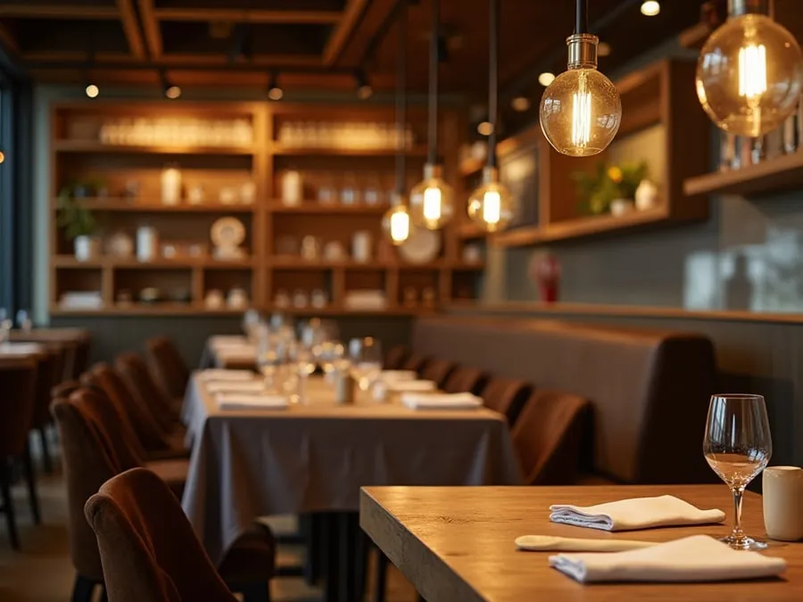
Nice Branding Agency makes a point that’s often overlooked in brand discussions: brands are more memorable when they stimulate as many senses as possible. A restaurant has a rare opportunity to engage all five senses simultaneously — sight, sound, smell, taste, and touch — in a way that no other commercial context matches.
Sight is the most discussed dimension: color palette, lighting, furniture style, art, architecture. But it’s often the sensory channel where designers over-index, neglecting the others.
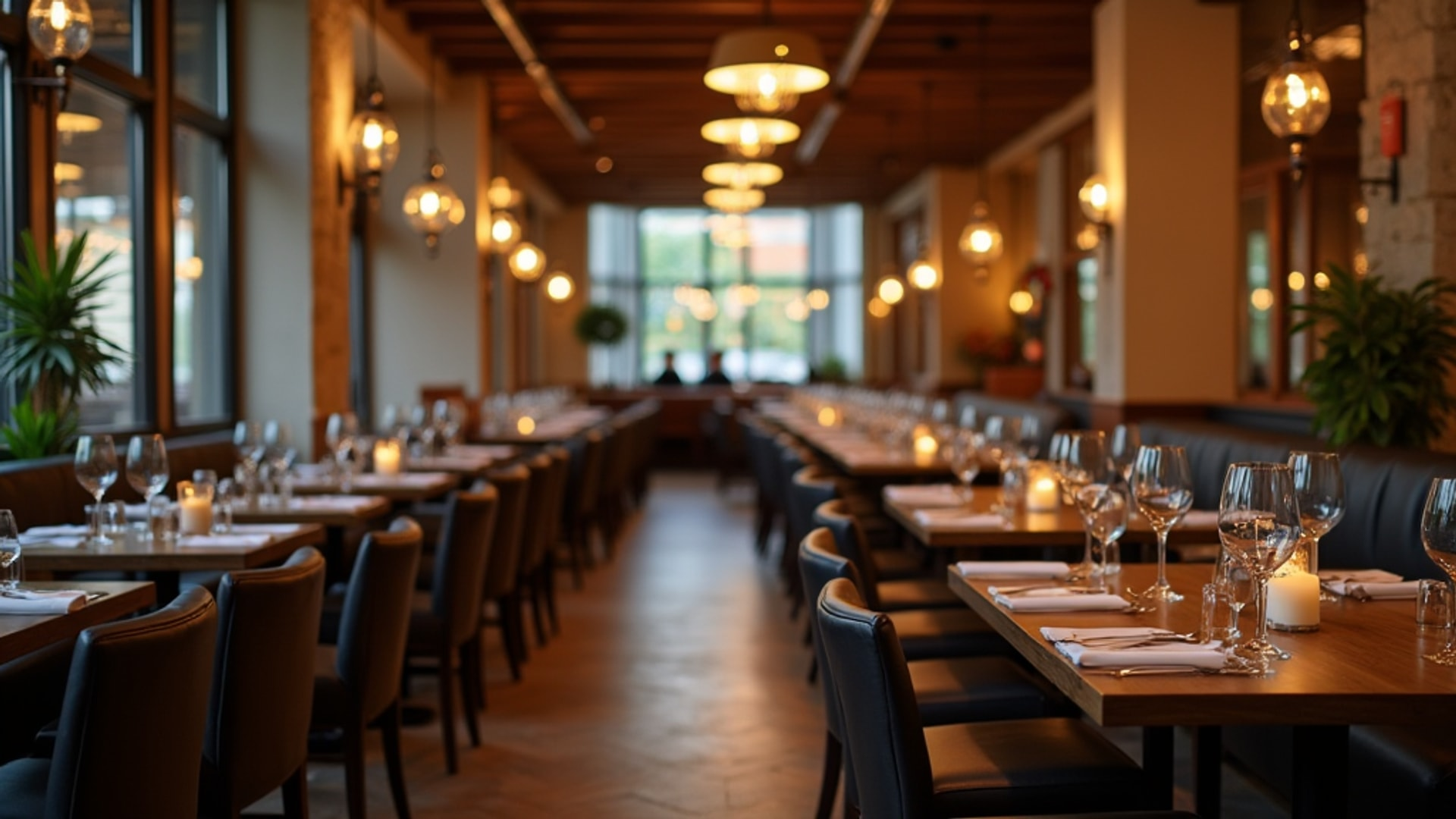
Sound is profoundly underappreciated as a brand element. The music selection — genre, tempo, volume, era — communicates brand identity as clearly as the color of the walls. A casual neighborhood bar with classical music at low volume sends a confused signal. A fine dining room with pop music at conversation-drowning levels destroys the atmosphere the interior design tried to create. Beyond music, the acoustic character of the room itself is a brand expression: a lively, buzzy room communicates energy and sociability; a quiet, soft-furnished room communicates intimacy and occasion.
Smell is the sense most directly linked to memory and emotion. The scent of a restaurant — from the kitchen, from the ventilation, from ambient diffusion — can be intentionally managed as a brand element. Some operators use subtle scent diffusion in the entrance or dining room to reinforce a sensory signature. At minimum, managing kitchen odors so they enhance rather than overwhelm the dining room is a basic requirement.
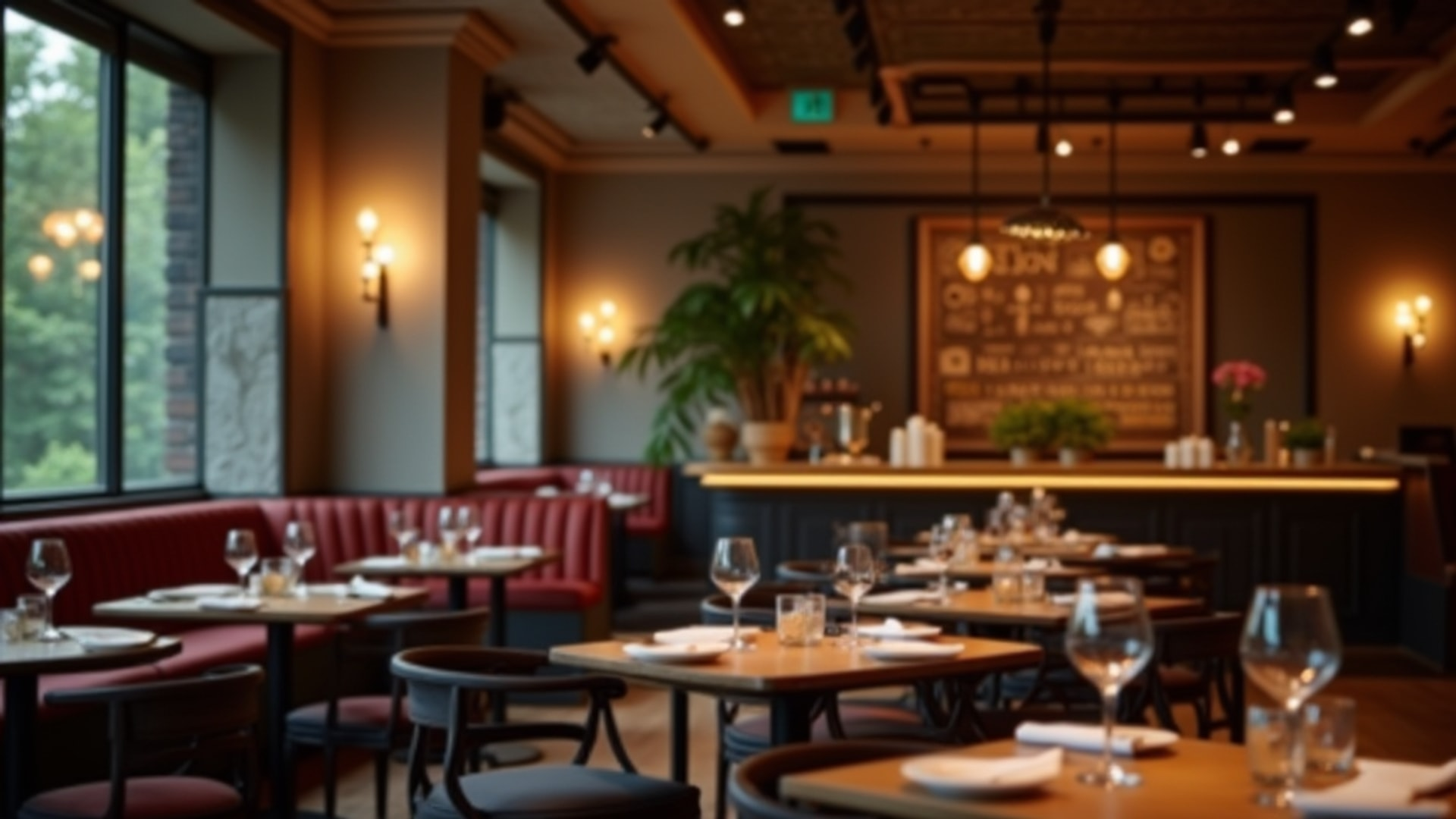
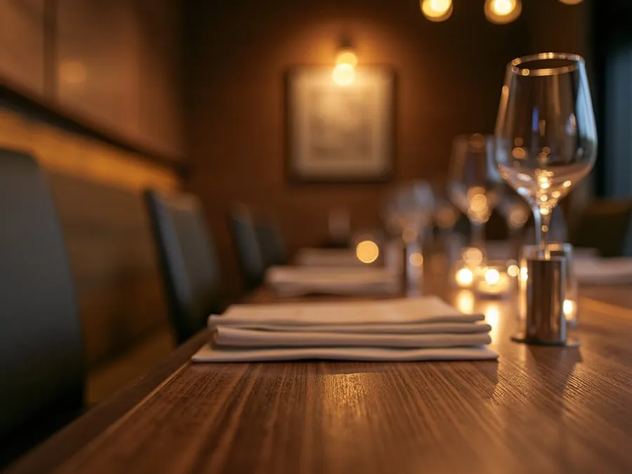
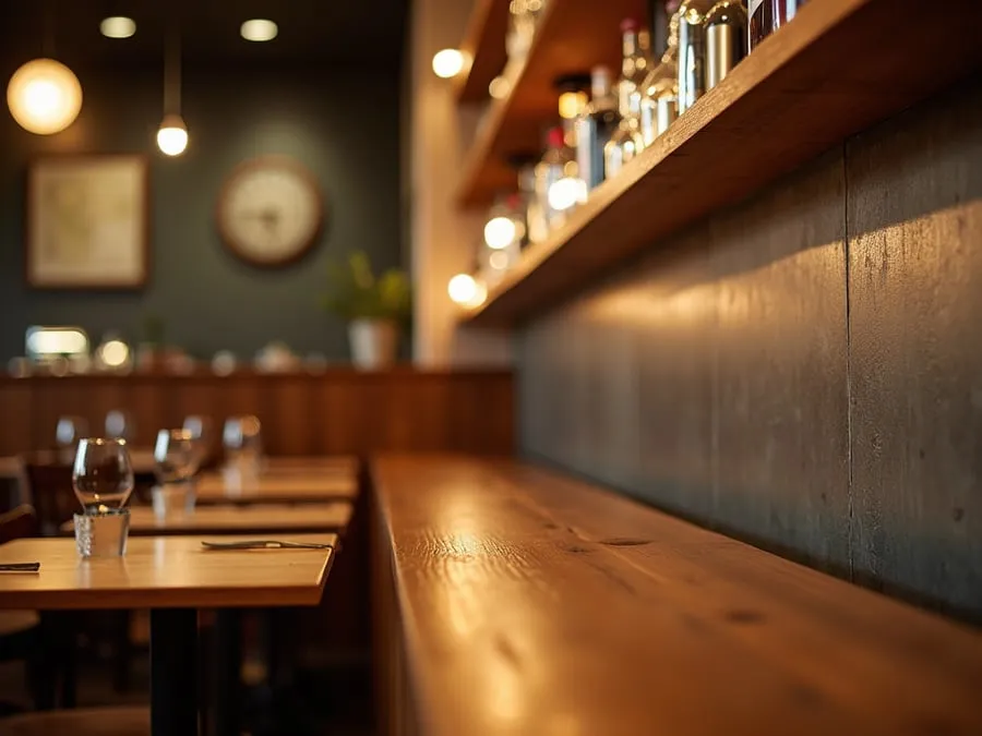
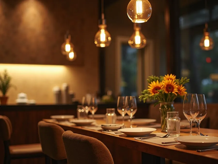
Touch operates through the materials guests contact: the tablecloth or bare wood, the texture of the menu cover, the weight of the glassware, the firmness of the chair cushion. These tactile cues communicate price point and care with striking directness. Heavy, smooth cutlery signals investment. Thin, lightweight flatware signals cost-cutting. Guests perceive this information instantly and unconsciously.
Taste, of course, is the core product — but the way food is presented and delivered carries brand meaning beyond the food itself. Plating style, vessel selection, garnish approach, and the way dishes are described by servers all function as brand communication.
Color: Your Brand’s Most Visible Signal
Brand colors should feature prominently in decor to create a cohesively branded interior, according to Nice Branding Agency’s analysis. But this requires a more nuanced approach than simply painting everything in your logo color.
Color psychology in restaurant contexts is well-documented: warm reds and oranges stimulate appetite and create energy; deep blues and greens create calm and sophistication; yellow creates warmth and approachability; neutrals like warm gray, cream, and natural wood tones provide a backdrop that allows food and people to become the focal points.
The practical approach is to identify one or two primary brand colors and deploy them at focal points — an accent wall, the upholstery, a bar front — while building the broader palette in complementary neutrals. All-over application of a brand color can quickly feel oppressive or kitschy. Strategic deployment at high-visual-impact surfaces creates brand visibility without saturation.
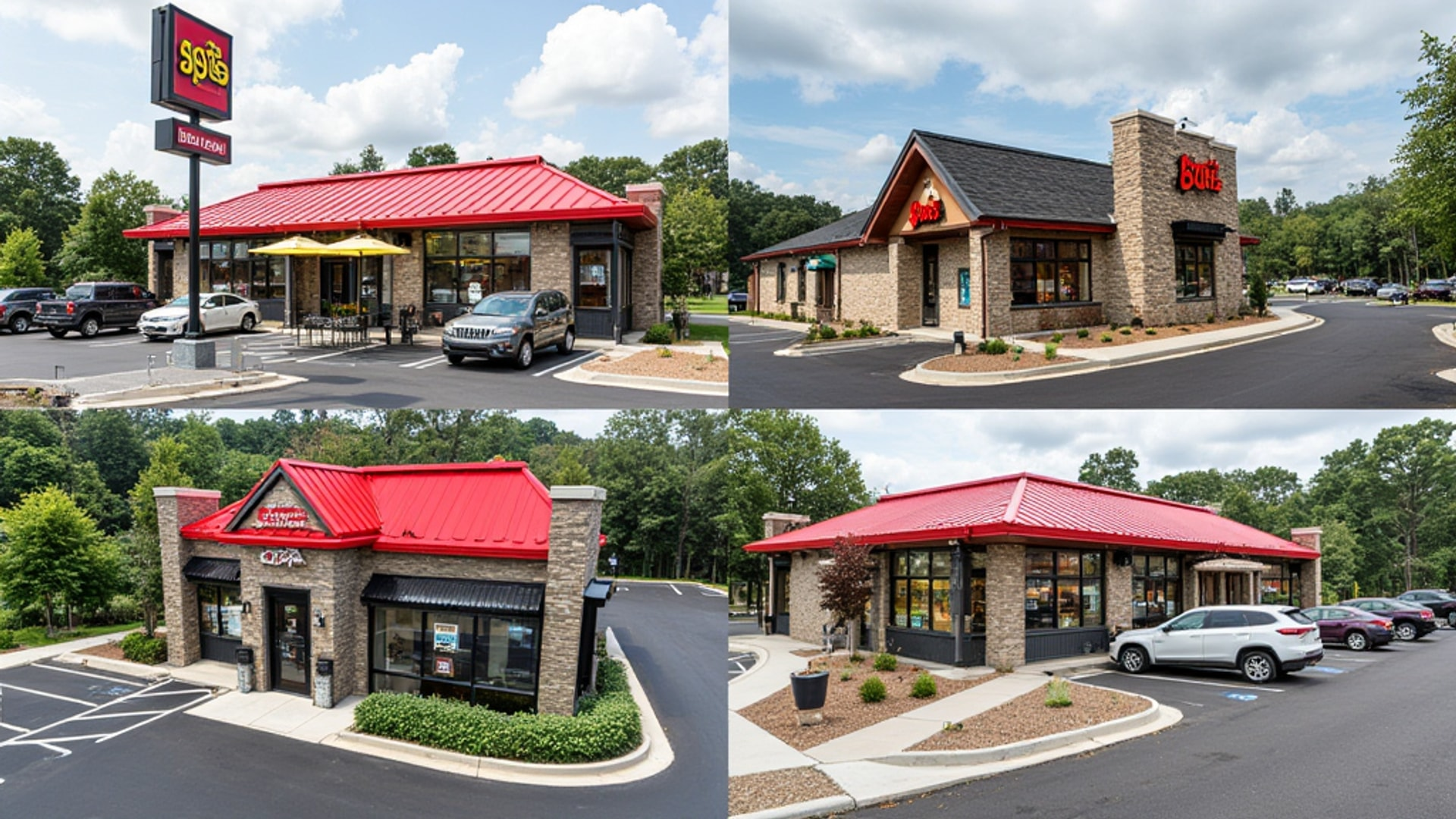
Color consistency matters especially for multi-location operations. As Nice Branding Agency observes, consistent restaurant color schemes across all branches strengthen brand recognition and customer loyalty. The moment a customer walks into your second or third location and it feels like a different restaurant, you’ve diluted the brand value your flagship built.
Touchpoints Beyond the Dining Room
The comprehensiveness of the brand-interior alignment extends to touchpoints that operators often neglect:
Staff uniforms are walking brand statements. Aprons, shirts, hats — the style, fit, and quality communicate exactly what the restaurant is trying to be. A polished linen apron on a server communicates care and craft. A branded polo shirt communicates accessibility and consistency. A casual uniform with visible staff expressing individual style might communicate creative culture. None of these is inherently right or wrong — what matters is whether they match the overall brand story.
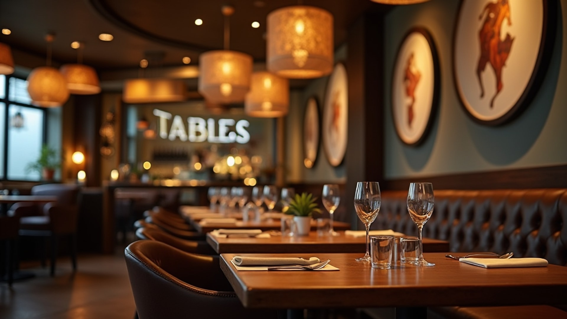
Tableware and serviceware are the brand items that guests physically handle throughout the meal. Plate shape, ceramic texture, glassware style, and napkin material are all legible brand signals. Nice Branding Agency specifically identifies tableware as a component that should reflect the overarching brand concept.
Signage — both exterior and interior — must match the graphic identity established in the brand system. Fonts, colors, and graphic style should be consistent from the street-level sign to the interior wayfinding to the restroom door labels. Inconsistency at any point signals sloppiness, even to guests who couldn’t articulate why it bothers them.
Menus are physical brand objects that guests hold in their hands for extended periods. The paper weight, the binding or folder quality, the layout approach, the photograph style, and the writing voice all contribute to brand experience. A menu that looks like it was created in a different era than the rest of the restaurant’s design breaks the cohesive narrative.
The bathroom is where many restaurants abandon brand consistency entirely, relying on institutional fixtures and generic hand soap that belong in an office building. The bathroom is a private moment in the guest experience and a powerful place to create a positive surprise. The material and fixture quality should be consistent with the dining room level. A handwritten poem, a distinctive light fixture, or a thoughtful touch in the bathroom can generate word-of-mouth in a way few other design elements can.
Brand Consistency Across Locations
For operators running multiple locations, brand-interior consistency is both more important and harder to maintain. According to Nice Branding Agency, a cohesive brand builds trust and reliability, giving guests comfort and predictability — and this expectation intensifies with each location a guest has visited.
The challenge is balancing brand consistency with appropriate local variation. Each location should immediately register as belonging to the same family while acknowledging its specific neighborhood or building context. The core brand elements — color palette, material direction, graphic identity, service approach — should be invariant. The specific way those elements manifest in each space can adapt to the physical realities of each location.
The mechanism for achieving this is a detailed brand standards document that specifies not just approved materials and colors but the principles behind those choices — so that designers working on new locations understand why the decisions were made and can make intelligent adaptations rather than rigid copies.
A Simple Alignment Test
Before finalizing any interior design decision — a material, a fixture, a furniture selection, a paint color — apply this test:
- Show the element to someone unfamiliar with your concept
- Ask them what kind of restaurant it belongs to
- If their answer matches your brand description, the element is aligned
- If their answer points elsewhere, investigate the disconnect
This test works because brand alignment is fundamentally about recognizability. When a design choice communicates “this is exactly the kind of restaurant that would make this choice,” the brand is working. When it communicates something else, or nothing at all, the brand is being diluted.
The brands that stick in guests’ memories and generate loyal followings are rarely the ones with the most beautiful individual design elements. They’re the ones where everything holds together — where every choice, from the biggest architectural gesture to the smallest tactile detail, tells the same story with the same conviction.
→ Read more: Restaurant Theme and Storytelling
→ Read more: Restaurant Art and Decor