· Design & Ambiance · 9 min read
Restaurant Entrance and Curb Appeal: Making a Strong First Impression
Your entrance is a 30-second audition — get the lighting, signage, and flow right, and you convert passersby into paying guests before they ever touch the door handle.
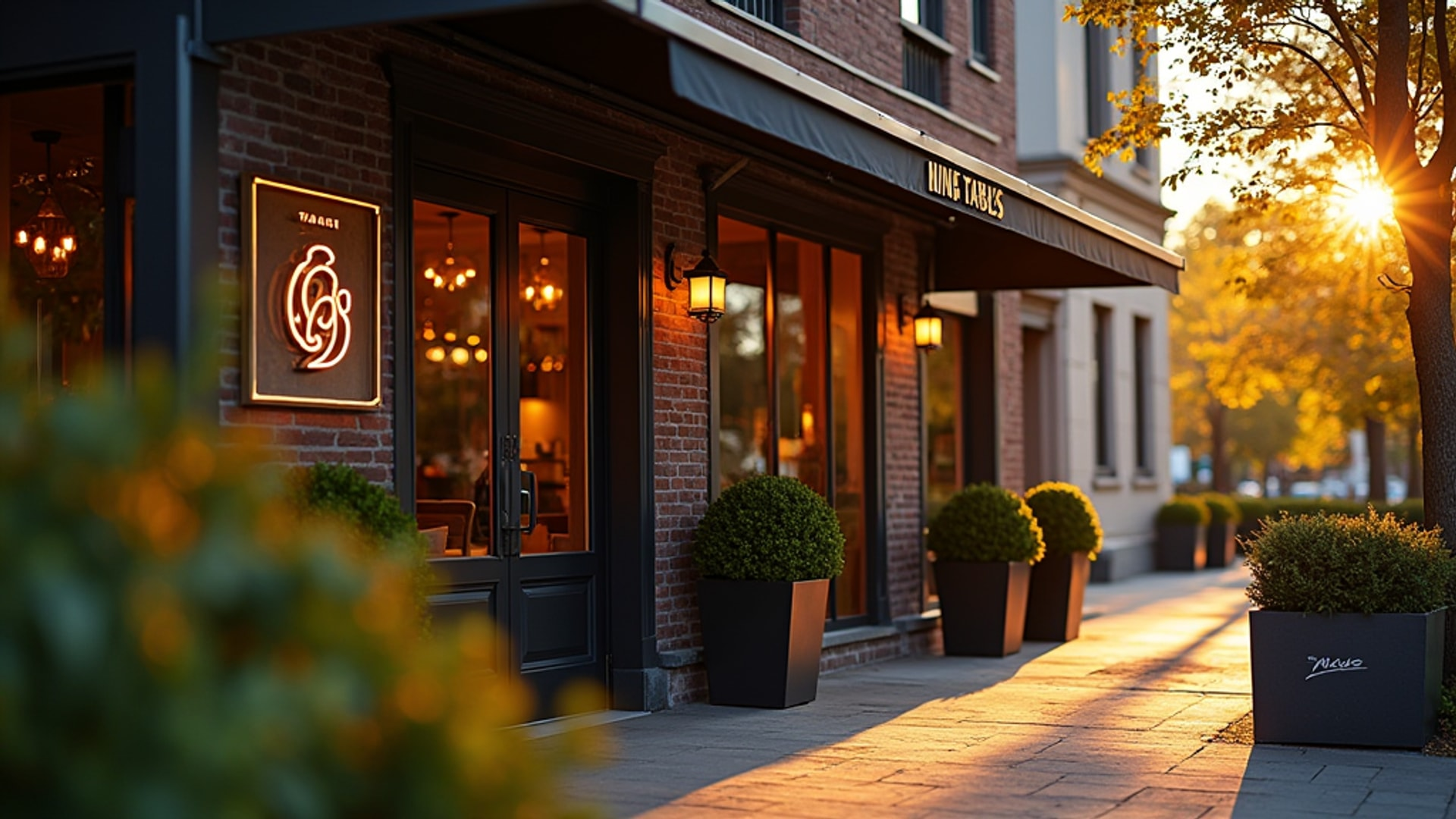
There is a moment that happens in the gap between a potential customer noticing your restaurant from across the street and deciding whether to walk in. That window is somewhere around 30 seconds, and it takes place entirely outside your dining room. In that window, your entrance — the signage, lighting, landscaping, door, and the visible slice of the interior — is doing all the selling.
This is not soft marketing theory. According to Toast’s research on restaurant entrance design, a strong curb appeal investment delivers measurable financial returns: more walk-in traffic from passersby who had no prior intention to dine, higher average check amounts driven by elevated guest expectations, and improved operational efficiency because a well-designed entry guides guests naturally without requiring staff intervention.
Get it wrong, and your server has to apologize for the first impression before she has even introduced herself.
What the Entrance Must Communicate in Seconds
The entrance has a specific job: communicate the restaurant’s style, quality level, and price point before a customer reads the menu or talks to anyone. Design firm Dunne Kozlowski describes this as the “brand moment” — design elements that communicate concept and tone without revealing everything at once, building anticipation rather than delivering instant comprehension.
Think about what your exterior actually says. A fast-casual taco place should telegraph informality, energy, and approachability. A fine dining room should suggest restraint, quality, and something worth dressing up for. A neighborhood bistro should look like somewhere you would want to come back to every week. If the exterior sends mixed or ambiguous signals — a formal awning over a casual sandwich shop, or a neon sign above a tasting menu restaurant — you are creating cognitive dissonance before the door is open.
Lighting: The Most Effective Tool You Have
Lighting is the single highest-impact exterior investment most restaurants can make. The approach that works best, according to Toast’s entrance design analysis, creates a thoughtful progression from the exterior to the interior:
Start at the sidewalk. Subtle ground-level pathway lighting draws the eye and signals that the space ahead is welcoming and curated. It does not need to be dramatic — the function is to create a visual thread from the street to the door.
Frame the entrance itself. Statement fixtures flanking the entry — modern sconces, pendant lights, architectural lighting that highlights the facade — mark the entry point as intentional and designed. This is where the lighting tells guests they have arrived somewhere.
Transition into the interior. The interior ambient lighting should be visible from outside and feel like a natural continuation of the exterior treatment, not a jarring shift. This gradient creates a drawing effect that guides guests inward.
Signage and lighting work together. The restaurant name should be well-lit from both vehicular and pedestrian distances, set in a typeface that reflects the concept. A font designed for a craft cocktail bar will read differently than block letters for a diner, and both should be different from the elegant script of a fine dining room.
Greenery and Landscaping: Signal Attention to Detail
Well-maintained plantings outside a restaurant accomplish something that no signage can: they communicate that this operation cares about details. This aligns with the principles of biophilic design. Lush plants and flowers draw in potential diners and create an organic, welcoming atmosphere. Guests unconsciously associate the care visible in a well-tended window box or entrance planting with the attention they expect to find in the kitchen.
This connection is not accidental. Research on consumer behavior in retail environments consistently shows that natural elements outside a business signal quality and attentiveness. The bar is not high — you are not competing with botanical gardens, you are competing with the concrete entrance next door.
Even small gestures matter: two well-chosen potted plants flanking the door, seasonal flowers, a manicured patch of greenery. The key word is maintained. Dead plants outside a restaurant communicate the same thing as dirty windows.
Weather Protection: Practical and Expected
Covered entry areas and awnings do double duty. They protect guests from rain while waiting, and they define the entry zone architecturally. Vestibules or airlocks also protect the dining room from temperature swings when exterior doors open during service — a practical detail that affects guest comfort for everyone inside.
Properly sized awnings or vestibules enhance comfort for waiting guests. “Properly sized” is doing work in that sentence. An undersized awning that leaves guests partially exposed in the rain fails both at weather protection and at the visual definition of the entry. An oversized awning that overwhelms the facade looks institutional. The awning should be proportional to the building and clearly mark the arrival point.
The Entry Area Footprint: Don’t Undersize It
A common and expensive mistake is undersizing the entry area to maximize revenue-generating dining space. Dunne Kozlowski is explicit about this: cramped, unclear entries increase guest anxiety and slow staff performance during peak periods.
The standard recommendation is approximately 50 square feet between exterior and interior doors for a basic vestibule, with additional space for waiting benches during busy periods. This number is a minimum for small operations; high-volume restaurants need considerably more. The entry area must:
- Prevent bottlenecks where arriving, departing, and waiting guests collide
- Provide clear visual direction toward the host stand
- Allow guests to pause and get their bearings without blocking the door
- Accommodate waiting parties without spilling onto the sidewalk
Squeezing out two more dining covers by shrinking the entry creates congestion that makes every peak service period harder than it needs to be.
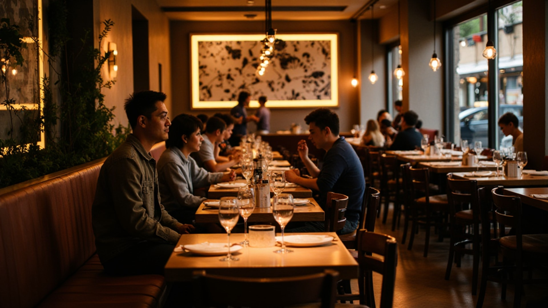
Host Stand Position and Visibility
In full-service restaurants, the host station typically sits directly in front of the main entry, according to Dunne Kozlowski’s entrance design analysis. The host area generally occupies about 50 square feet and must accommodate a tablet or reservation system, a charging station, and workspace for managing seating logistics.
The critical design requirement is sightlines: the host must be able to see arriving guests the moment they enter, and arriving guests must be able to see the host immediately. This enables the prompt, warm greeting that transforms an arrival from a transaction into hospitality.
Poor host stand placement — tucked around a corner, obscured by a decorative element, positioned too far from the door — creates the awkward dance where guests stand in the entry not knowing where to go. According to Dunne Kozlowski, intuitive flow means that from the moment guests step inside, it should be immediately obvious where to stand and where to go, achieved through layout and sightlines rather than prominent directional signage.
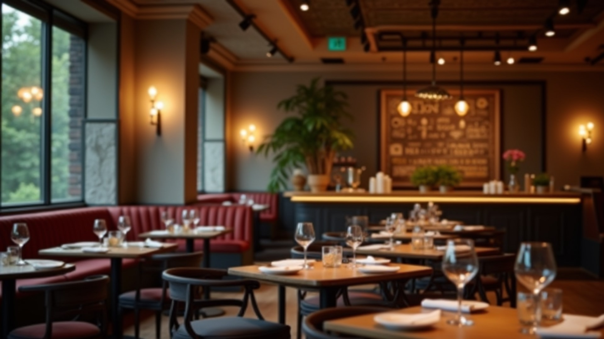
The Waiting Area as a Revenue Asset
The waiting area has evolved from functional necessity to a strategic element of the guest experience. Several practical design choices make waiting less frustrating:
Maintain visual connection. Guests in the waiting area should be able to see the host stand at all times. The common frustration of feeling overlooked or forgotten starts when this visual connection is broken. The waiting area should maintain sight lines to the host stand so guests do not feel forgotten.
Vary seating options. Two-person settees accommodate couples. Larger benches work for groups. The waiting area should reflect the party sizes the restaurant typically serves. Hard benches with no back support send a message — that the operator wants you to feel uncomfortable enough to encourage quick turnover. That message is not worth the furniture savings.
Use the space to prime guests. Menus, daily specials, and event displays in the waiting area serve dual purposes: engaging guests and priming them for ordering decisions that will speed table service once they are seated. Digital displays showing menus and specials engage guests during their wait.
Separate dine-in from takeout traffic. Clearly delineated spaces separate dine-in waiting from takeout pickup to prevent congestion. This becomes critical as off-premises orders grow: mixing guests waiting for a table with customers picking up online orders creates chaotic entries that frustrate everyone.
Three Entry Design Strategies
Dunne Kozlowski identifies three primary approaches to entry design, each suited to different concepts:
Controlled or intimate entry. Focuses on service, guiding guests through a carefully orchestrated sequence. Works well for full-service restaurants where the host interaction sets the tone.
Framed heartbeat entry. Directs attention toward a key visual element — an open kitchen, a dramatic bar, an architectural feature. Guests enter and immediately see the visual centerpiece of the concept. Works well when you have a feature worth showcasing.
Immersive entry. Common in bar-driven concepts, this plunges guests immediately into the energy and atmosphere of the space. No transition zone; the experience starts at the door. Works well in high-energy environments where the atmosphere is the product.
The choice is not arbitrary — it should align with how the rest of the space is designed and what kind of experience you are selling.
Durable Materials at the Threshold
The entry zone takes more physical abuse than anywhere else in the restaurant. Foot traffic is concentrated, guests track in moisture from rain, and the threshold itself is subject to constant use. Durable materials for high-traffic zones maintain appearance under heavy foot traffic.
This means threshold materials — flooring, door hardware, door surfaces, any surfaces guests touch on the way in — should be specified for commercial durability rather than residential aesthetics. Beautiful stone flooring that shows every scuff within six months will undermine the entrance investment. Door hardware that shows wear quickly looks neglected. The entry should look as good on a Tuesday evening in November as it did on opening day.
The Financial Case for Entrance Investment
The return on entrance design investment is measurable through three mechanisms, according to Toast:
Increased walk-in traffic. Passersby who had not planned to dine become customers when the exterior communicates something appealing. Strong curb appeal converts foot traffic that you would otherwise not capture.
Higher average checks. Elevated guest expectations set by an impressive entrance carry into the dining room. Guests who arrive expecting quality spend accordingly.
Reduced operational burden. An entry that naturally guides guest flow reduces the labor cost of managing arrivals. When guests know immediately where to go and what to do, the host spends less time redirecting and more time welcoming.
The entrance is not a design indulgence. It is one of the most leveraged investments in the building.
→ Read more: Restaurant Window Design
→ Read more: Restaurant Naming and Branding